
Experience and visual design for a new stress coaching program
I partnered with coaches, Dr. Krista Scott-Dixon and Justin Hing, to help realize the vision of their 6-week coaching program that builds daily-life skills for managing stress, recovering better, and ultimately becoming more resilient. This project is phase one of a side hustle that they’re are planning to grow into something larger.
Responsibilities
📝 Audited the current state of the web app that they had started to build
🔍 Identified usability issues and proposed solutions
🎨 Defined the design direction and branding
📱 Created a prototype for quick user feedback
🚧 Ongoing designing all the things; aka make things “suck less”
Outcome
We successfully launched a BETA program with 36 test clients and are making improvements based on their feedback.
The first cohort of clients is currently in session. Coaches are reporting high engagement in the community forums and positive feedback on the program.
This is an ongoing project…
Coaches Krista & Justin ran a version of the program on Facebook and it was a hit. Based on that success, they wanted to create a more custom and fun experience for their clients.
OVERVIEW
Outcomes for the project
1️⃣ Design a coaching program experience with a daily delivery of activities so that clients can build skills for managing stress, recovering better, and becoming more resilient.
2️⃣ Build a sense of community through engaging forum discussions led by the coaches so that clients feel supported and accountable.
3️⃣ Design the program with the vision of multiple programs on a single platform so that Coaches Krista and Justin can create a health coaching oasis and reach more people.

AUDIT & RECOMMENDATIONS
I did an audit to get clear on how everything was working and to understand why things were the way they were.
🎓 What I learned
The 3rd party template in Wordpress that was being used was causing navigational conflicts and confusion.
The template was over-engineered for our use case and we didn’t need many of the features available.
The existing UI was confusing and cumbersome to use.
Oversized cards that forced people to scroll... a lot.
Unclear CTAs
Accessibility issues
✅ I made recommendations to address problems found.
A new, simplified navigation structure that would scale to accommodate multiple program offerings.
Remove redundancies created by conflicts between wordpress and the template.
Remove unnecessary features (ie Badges) to focus on the core purpose of the program.
DESIGNS
The vibe of the course is fun and supportive. Makes sense, Krista and Justin are fun and supportive people. They liberally use emojis throughout the content which adds a feeling of playfulness and makes them more approachable, so I incorporated the emojis into the program cards and made some custom additions along the way.
I created a design direction that is fun and approachable. Less stress, more joy.
The program delivers a new bite-sized activity every day for 6 weeks. Activities can include readings, videos, assessments, or reflections. After each activity, there is a prompt for users to share their thoughts in the forum where the coaches and other community members can engage.

Coach Krista aka KSD
Coach Justin


Above: example of daily activity page with the community discussion.

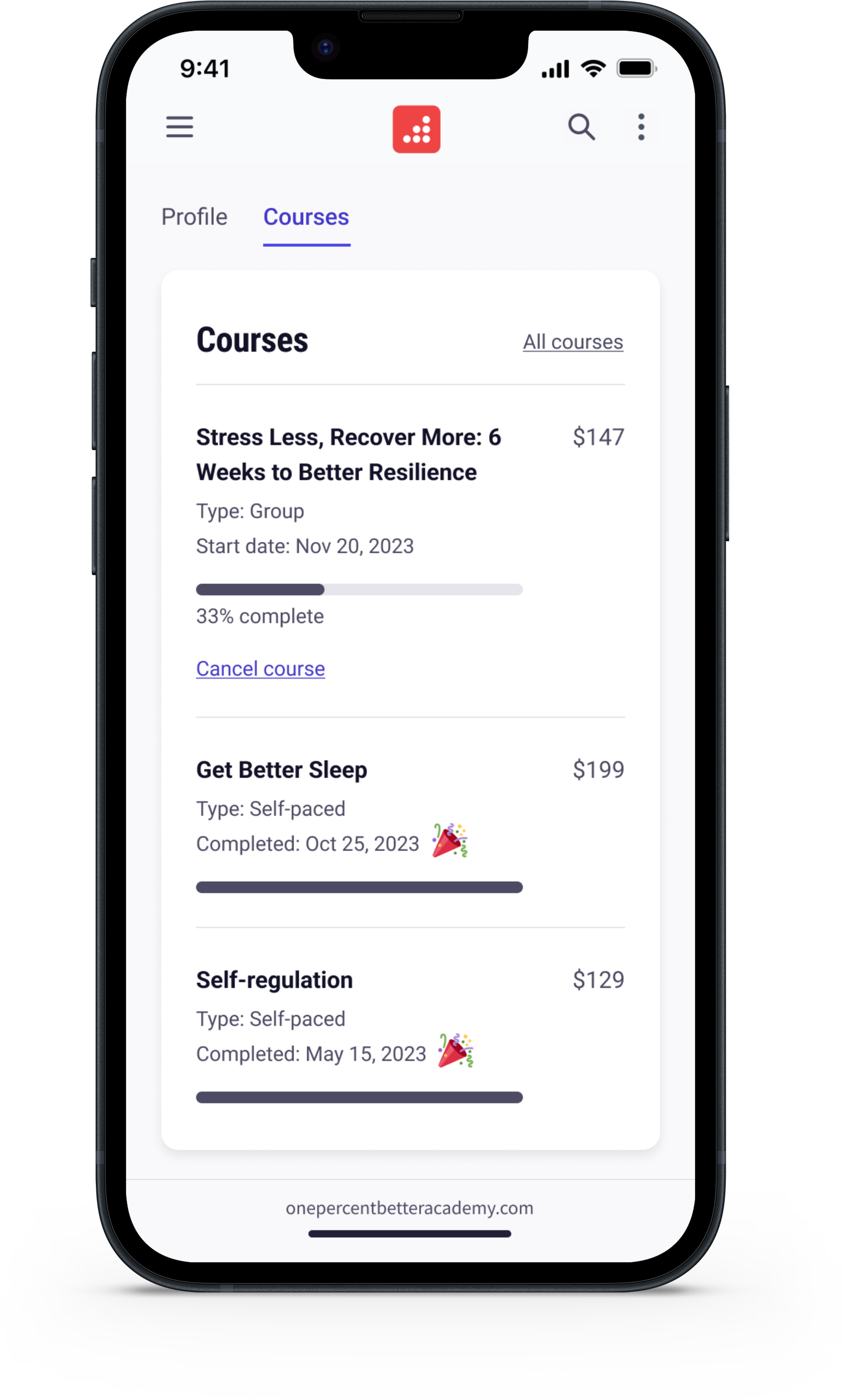

Left and center: Profile page showing a future state where the client can enroll in more programs; Right: Message with a coach.
EARLY LEARNINGS
Based on feedback from our test group
✅ We moved the forum discussions from their own separate tab to the individual activity page because moving between the two screens was cumbersome.
✅ We made posting a response vs posting a reply more clear because clients told us that they weren’t sure if they were responding to the initial question or to someone’s reply.
🔲 We’re adding the ability to like a response because sometimes you only want to ❤️ something.
We are a few weeks into the first cohort and the coaches are reporting high engagement in the forums.