Experience design for sharing resources in the ProCoach app


Company
Precision Nutrition
Project goal
To make it easier for Precision Nutrition (PN) Health Coaches to share in-house resources with their clients through the existing ProCoach App. Make it so that they can focus more on coaching and less on technical tasks
Timeline
12 weeks for research, design, and development for the MVP.
Responsibilities
• UX Outcomes
• User flows
• Wireframes
• UI Design
TL;DR
The coaches were really happy when this feature was released and quickly incorporated into their workflow.
PRODUCT OVERVIEW
ProCoach is the nutrition & health coaching software built by PN to support their certified coaches.
Coach interviews, customer care, and the ProCoach Facebook community told us that coaches were looking for an easy way to share PN’s nutrition and behavior change resources with their clients.
The recently updated version of the software didn’t provide an easy way to do that and it was frustrating coaches and causing unnecessary workarounds.

PROJECT SUMMARY
Our team saw an opportunity to alleviate coach frustration and increase engagement by creating a way for coaches to share resources via the in-app messaging system.
In addition, by directly sending a message to the client with a helpful resource at exactly the right time, the coach’s credibility and professionalism shine through and the coach and client relationship can grow stronger.

PROCESS
For this 12-week project, I provided support during user research interviews, created user journeys, workshopped UX Outcomes with the team, and was responsible for the experience and visual design of the feature.

RESEARCH & DISCOVERY
Provided support to the PM/User Researcher (aka took notes) during user interviews. Based on the interviews, I created user journey maps for each coach.
UX OUTCOMES
We (PM & myself) ran a UX Outcome workshop in Miro where we all worked through the following question: If we do a really great job on this feature, how will we improve our coach and their clients’ lives?
EXPERIENCE DESIGN
I mapped the user flows and created wireframes for the coach and client experience. I worked with the developers to ensure that the designs aligned with the backend capabilities.
VISUAL DESIGN
After working with the developers to get the kinks out, I created the visual designs as they started to build out the feature.
RESEARCH & DISCOVERY
The Project Manager / User Researcher conducted 6 remote, 1 hour user interviews with coaches to understand how they used the PN resources in the past and how they were using the new version.
Based on the interviews, I created user journeys for each coach to help understand the pain points of the new version.
RESEARCH & DISCOVERY
What we learned from the user interviews…
Overall, coaches were enjoying the new direction of the software, but the inability to easily share (or provide focus on) PN’s “golden sauce” was a sore spot.

Coaches generally had a handful of go-to resources that they shared with all their clients. These resources were primarily self-reflection resources where clients would input thoughtful responses to questions.
Coaches were coming up with some creative workarounds to the problem like copy & pasting resource content and either directly sending it to clients or creating pdfs that they would then email or text to their clients.
UX OUTCOMES
Using what we learned, I co-ran a UX Outcome workshop to get alignment on what outcomes we would use to determine success.
In Miro, we all worked through the question:
If we do a really great job of solving this problem, how will we improve our coaches’ lives and their clients’ lives?By starting with creating outcomes, we were able to focus on the human-ness of the problem vs jumping to technical solutions. The team was able to understand why we were building the feature and how it would help our coaches and their clients.
After we decided on our outcomes, we were able to use them in our shaping docs and user stories. And I was able to use them in designing solutions.

UX OUTCOMES
We decided on 1 outcome for the client and 2 for the coaches.
COACH OUTCOME 1
If we do a really great job on providing the ability to share resources in ProCoach,
we will improve our Coaches’ lives by giving them an easy way to bring their clients’ attention to valuable content,
so that they can spend less time figuring out how to get them the content and more time on coaching.
CLIENT OUTCOME
If we do a really great job on providing the ability to share resources in ProCoach,
we will improve Clients’ lives by highlighting hand-selected content from their coach,
so that they know what they should focus on so that they will be less overwhelmed.
COACH OUTCOME 2
If we do a really great job of calling out resources that require self-reflection,
we will improve our Coaches’ lives by making it easier for them to quickly find the most commonly shared resources in the library,
so that they can make quick work of getting the resource to the client.
EXPERIENCE DESIGN
Next, I mapped out user flows in collaboration with the developer to make sure that the solution was feasible within our current framework.
The solution used the in-app messaging feature to share the resources from the library within ProCoach. This allowed the coach to hand-pick the resource and send it directly to the client along with a personal note – keeping the coach-client relationship the primary focus.
VISUAL DESIGN
Then onto the visual design – the coach experience.
Resource library. In the PN coaching framework, all resources are associated with a specific Practice that is assigned to the client. There are multiple resources available to support the Practice, which can be overwhelming to both the coach and the client. In this view, the highly used self-reflection resources (labeled Owner’s Manual) have been grouped together and positioned at the top of the list for easy discoverability.
Resource detail page. In V1, the coach must go to the resource detail page to send the resource to their client. The ability to send from the library view is another future enhancement.
Send modal. The coach can add a personalized message to be sent along with the resource. We’re always looking for ways to strengthen the coach-client relationship so by sending a direct message, the client feels more connected to their coach (and more likely to do the thing that the coach is recommending).
Messages. The message and the resource link is sent via the in-app messaging system.
… and the client experience.

Notification. The client receives a notification when their coach sends them a message.

Messages. A link to the resource along with a personal note from their coach is delivered through the in-app messaging system. We chose to use our messaging system over having the resource link show up on their daily To-Do list for three reasons: 1) the coach can personalize and add context to why they’re asking the client to do something, 2) clients are more likely to respond to a personal message, and 3) it was quicker to build and allowed us to get V1 out to our clients faster.

Resource. The resource is accessible from the messages window as well as the client’s archive (where all assigned Resources live in the client app).
OUTCOMES & LESSONS
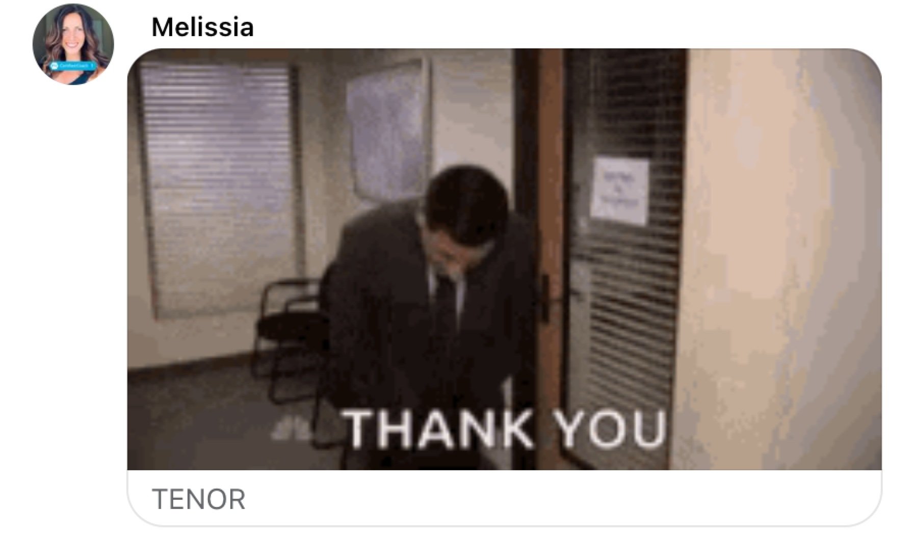
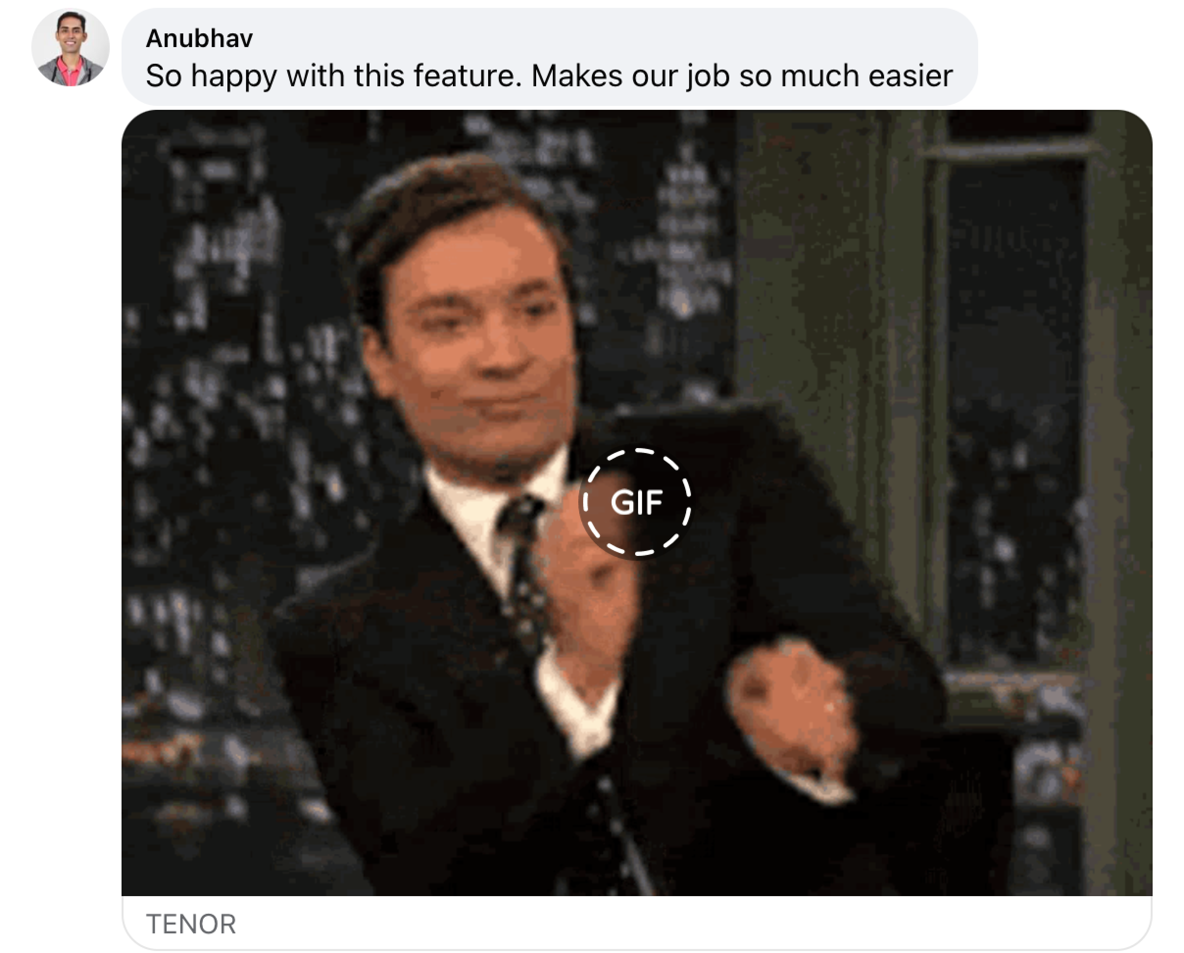
Kudos from coaches
The ability to send a resource solved the acute pain point that coaches felt around not being able to find or bring clients’ attention to a specific resource. After the release, the coaches let us know how they felt about the update.


OUTCOMES & LESSONS
What I learned…

The PN Coach community is very dedicated to their clients and to PN. They will happily get on a call to let us know what is and is not working. Having that built in community feedback loop is invaluable. They are also big fans of The Office and gifs.
This was the team’s first experience creating UX Outcomes. By the time we were finished with the project, a dev commented on how “uneventful” and smooth the whole process was for this feature. Success!

We need to improve our ability to continually measure the success of our UX outcomes. The lack of focus on insuring we had clean data from the planned metrics prevented our ability to refine and improve our delivery after MVP.